![]()
![]()
We don’t just design labels. We craft enduring brand identites that articulate value. Connect with discerning consumers, and ensure your product moves off the shelf.
With over 25 years of experience as a food and beverage design agency, we know what makes a product move off the shelf: packaging design for food and beverages that not only looks beautiful but also tells the right story and connects with buyers. From gourmet packaging design to craft beverage branding, we combine strategy, creativity, and trend awareness to create brands that sell.
SIGNATURE CASE STUDIES
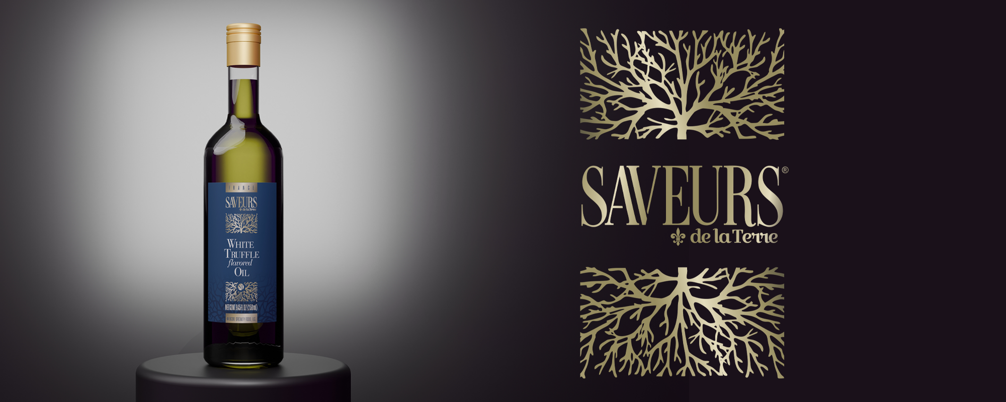
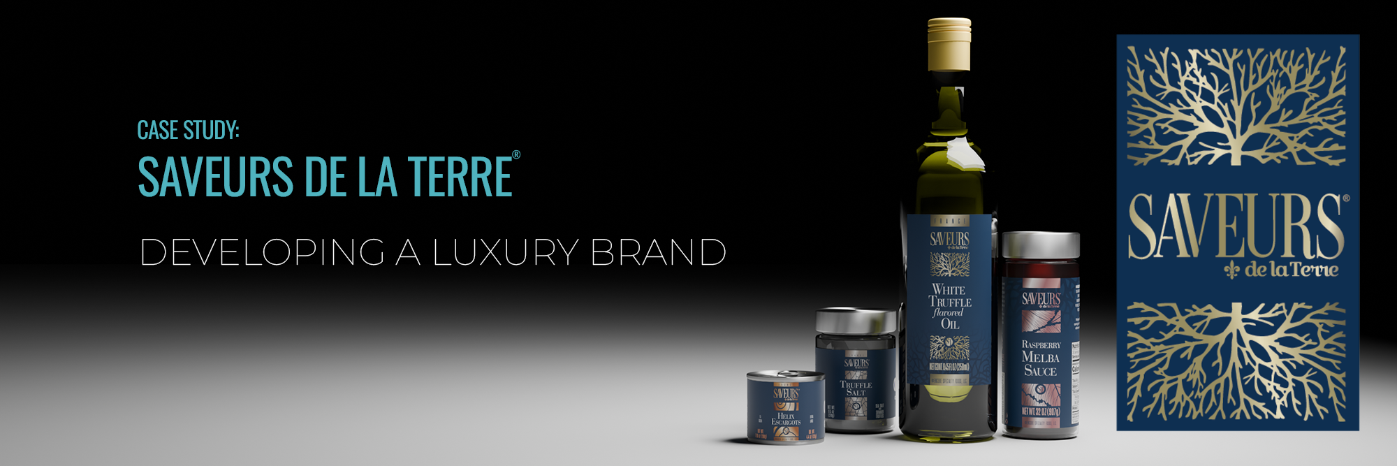
A Gourmet French food importer sought to elevate its branding to broaden their customer base. The rebranding involved the use of rich blues and copper textures to convey a sense of luxury. A custom typeface was created, complemented by imagery that aimed to evoke a connection to the bounties of the earth. The comprehensive project encompassed a full rebranding (with assets, fonts, color guides, and logo), various product label designs, as well as point of sale graphics and an ad suite. This strategic upgrade not only enhanced the aesthetic appeal of the Saveurs de la Terre® brand but also positioned it squarely within the realm of high-end luxury, ensuring its strong appeal to discerning consumers in the market.
... see more.
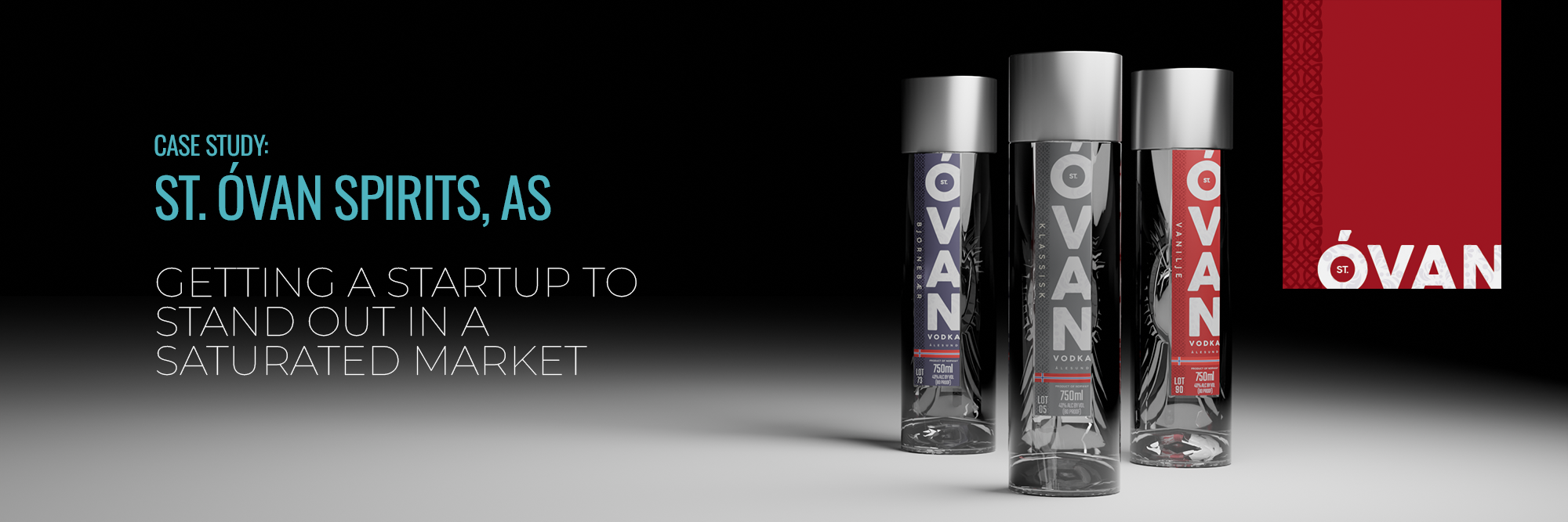
St. Óvan a boutique distillery located in Ålesund Norway, known locally for its commitment to producing high-quality vodka using traditional methods, had a desire to grow beyond a local curiosity and break into the competitive North American market. The team at St. Óvan knew that a strong brand identity was essential - one that spoke not only to their new target audience, but also connected with their traditional customers in Norway, so they contacted Bydand Creative. They wanted to emphasize their Norwegian roots, stay true to Scandinavian design aesthetics, the high quality of their vodka, and their connection to Viking tradition.
...see more.
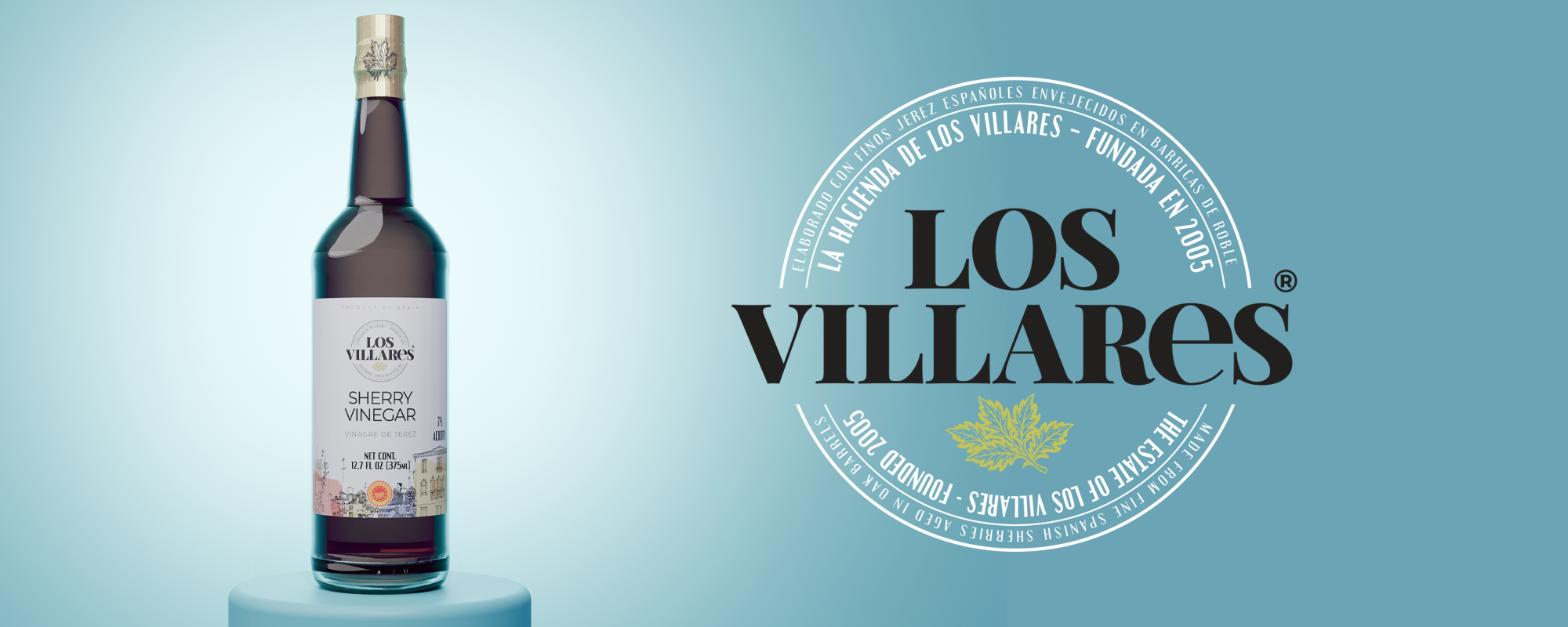
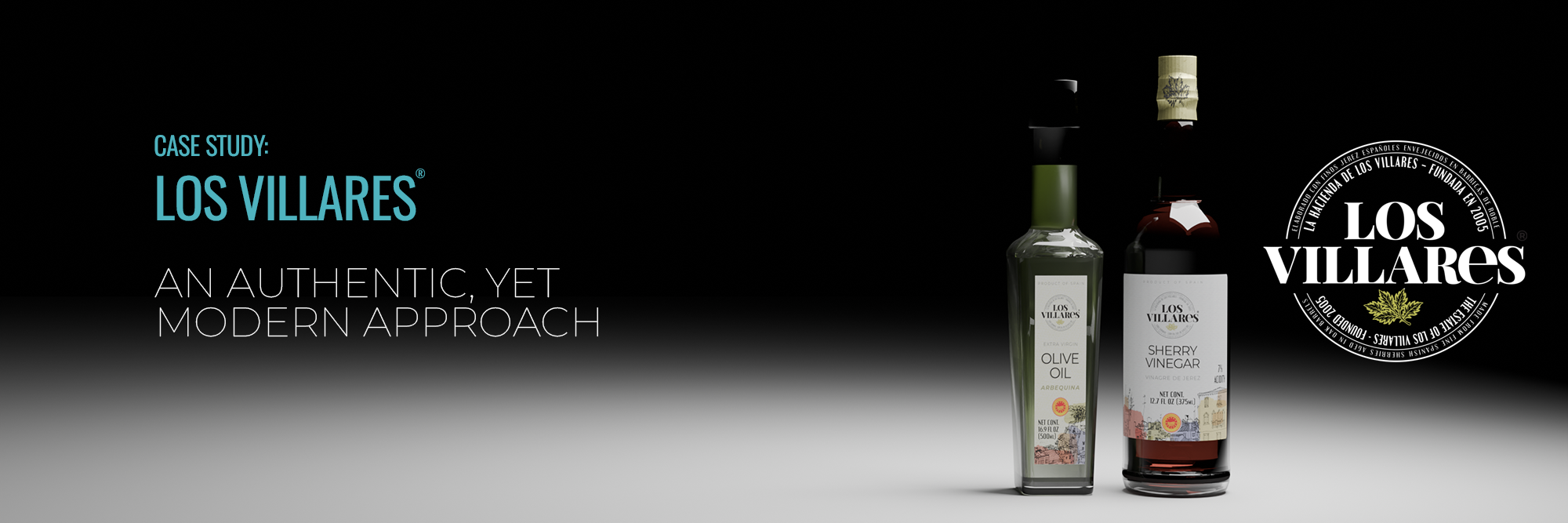
In response to the needs of Los Villares®, a Gourmet Spanish food product importer seeking to evolve their brand identity into a more authentic and modern reflection of Spanish culture, we embarked on an exciting journey inspired by the art, culinary traditions, and rich culture of Spain's "Villages" region. By incorporating watercolors and hand-drawn line art, we aimed to encapsulate the essence of this vibrant locale. We crafted a circular logo concept with a modified typeface, containing intricate details that invite exploration and captivate viewers. This ongoing project encompasses a comprehensive set of branding guidelines, multiple product labels, and various point-of-sale collateral materials to ensure a cohesive and compelling brand experience. By infusing every design element with the spirit of Spanish sensibilities, we are dedicated to creating a brand identity for Los Villares that resonates with both tradition and modernity.
...see more.

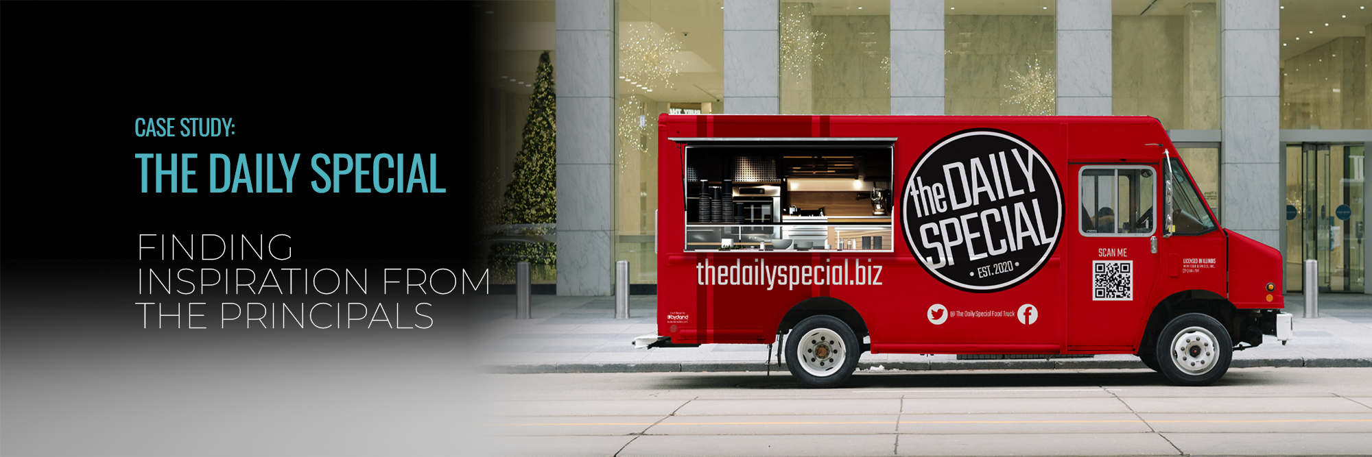
In the case study of "The Daily Special," the challenge was to design a brand package for a fleet of food trucks that embodied a "friendly and approachable" vibe. The concept of revolving menus based on seasonal produce demanded a unique visual identity that stood out without being generic. Drawing inspiration from the counterculture spirit of the owners, we opted for bold reds, a striking high-contrast logo, and a retro racing stripe reminiscent of the rebellious yet optimistic energy driving the business. This extensive project involved crafting a comprehensive brand package that included designing collateral materials, packaging, uniforms, and a streamlined online ad suite exclusively for social media. The result was a cohesive and eye-catching visual identity that perfectly encapsulated the essence of "The Daily Special" food trucks.
... see more.
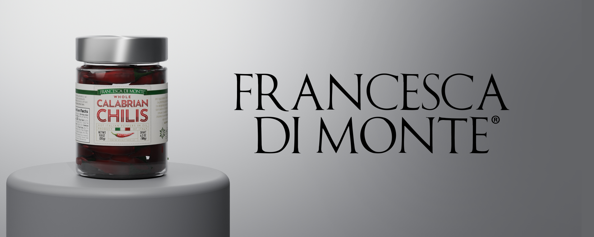
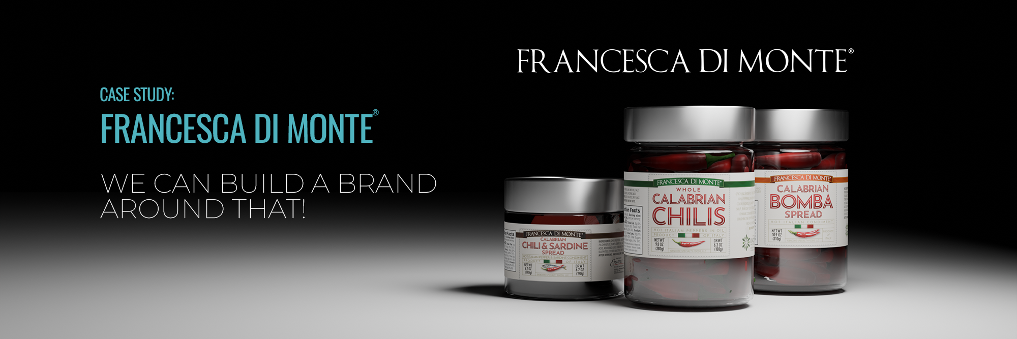
Looking at Francesca di Monte®, a logo without a brand was transformed into a cohesive brand identity by leveraging the existing logo as the foundation. The importer, specializing in foods from Italy for over two decades, recognized the need to unify their design elements for a more impactful visual representation. Collaborating with the team at FDM, we revamped their outdated and inconsistent designs to better showcase the uniqueness of their products. Drawing inspiration from Italian advertising history, a custom alphabet was created for product labels, injecting a fresh and captivating look. By introducing structured label designs with intricate details, we crafted an engaging visual experience while maintaining focus on the products' vibrant textures. Opting for neutral backgrounds and smaller label sizes to enhance product visibility, the project encompassed a comprehensive redesign for a diverse range of imported Italian products along with promotional materials. The result was a brand transformation that not only modernized their visual identity but also showcased the essence of Italian authenticity and quality.
... see more.